How do I use interactive graphs?
Some reports provide interactive graphs for PRO members.
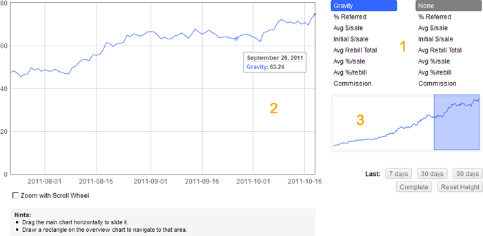
Such graphs consist of 3 parts:
1. The control panel (on the right). Here you can set which stats are displayed on the main graph (up to 2).
2. The main chart (on the left).
- When you move your mouse over it, you see the actual values of the set stats.
- You can drag this chart horizontally to slide it.
- If the 'Zoom with Scroll Wheel' mode is enabled, you can use the Scroll Wheel to zoom in/out.
3. The overview chart (on the right) that shows you which region is currently displayed on the main chart.
- You can draw a rectangle on this chart to navigate to that area.
- The overview chart is bound to the first set statistic.
As well, there are some useful buttons below the overview chart. They help you:
- to navigate to the last 7, 30, 90, 365 days;
- to display the complete time period;
- to reset the height of the charts to cover all data of the first statistic.